
Data visualizations are a great communication tool, either for understanding something yourself, or helping others understand your message. We’ve all heard the phrase “A picture is worth a thousand words”, and science actually supports this saying! As the paper “The Science of Visual Data Communication: What Works” by Franconeri et al. states:
Effectively designed data visualizations allow viewers to use their powerful visual systems to understand patterns in data (…).
However, there is an important caveat in the paper:
But ineffectively designed visualizations can cause confusion, misunderstanding, or even distrust – especially among viewers with low graphical literacy.
In a series of posts, I want to show some techniques you can use to tailor your data visualization to our powerful visual system, so you can build understanding in your audience, and avoid confusion and distrust. I will show code examples in Python, using the library plotly, which is a great place to start when you want to visualize your data.
The theme of this first post is a pre-requisite:
Assume someone in your audience has impaired color vision
Around 1 in 25 has impaired color vision of some type and degree. This is an important step to make sure it is possible to communicate your message. It is not always easy, though. Here is a picture of plotly’s 10 default colors seen as if you have red blindness:

The first two I can differentiate quite easily, but after that it gets murky. Luckily, there are many techniques and tools we can use.
We’ll start with some power consumption data from the Norwegian power system and make a line plot. The data can be downloaded at https://www.statnett.no/for-aktorer-i-kraftbransjen/tall-og-data-fra-kraftsystemet/#produksjon-og-forbruk. To make plotting easier, we’ll add a column for the hour of day and the weekday name.
# the file is HTML and must be read using read_html
# We use the first row as the header, and the first column as the index
[df] = pd.read_html("ProductionConsumption-2024.xls", header=0, index_col=0)

# Convert the index to datetime
df.index = pd.to_datetime(
    df.index, format="%d.%m.%Y %H:%M:%S %z",utc=True
).tz_convert("Europe/Oslo")

# GWh will be easier to read on the plot axis
df["Consumption (GWh)"] = df["Consumption"] / 1_000

# Adding columns for day of week and hour of day
df["Weekday"] = df.index.day_name()
df["Hour of day"] = df.index.hour
Now we’re ready to plot. We’ll create a line plot of the power consumption per hour using the px.line function in plotly express. When we use our dataframe as the first input argument, we can use column names in the dataframe for the other arguments x, y and color. We also filter the dataframe to only plot the consumption in the first first Friday and Saturday of 2024.
px.line(
    df["2024-01-05":"2024-01-06"], # filter on these dates
    x="Hour of day",
    y="Consumption (GWh)",
    color="Weekday"
)
The resulting line chart shows the difference in Norwegian power consumption on weekdays and weekends. On weekdays, most of us get up early and turn on our appliances, and on weekends, we get up later and also cause an afternoon peak in consumption, perhaps when we prepare a nice weekend dinner:
The two first default plotly colors work well for many with color vision impairment, but in general, there are a few techniques we can use to ensure our visualizations are accessible to our audience.
Double encode color
Double encoding means using two different markers that differentiate between the two lines, for example color and dashes. The dashes can be differentiated by someone with color vision impairment. It is good practice to avoid conveying information purely through color. In plotly, double enconding is quite easy, we can just add the argument line_dash for the column we want to add dashes to.
px.line(
    df["2024-01-05":"2024-01-06"],
    x="Hour of day",
    y="Consumption (GWh)",
    color="Weekday",
    line_dash="Weekday"
One drawback with double encoding is that I find myself referring to the colors of the lines, i.e. “the blue line”, which could be unclear for someone with color vision impairment. To prevent this, we could just remove the color encoding:
px.line(
    df["2024-01-05":"2024-01-06"],
    x="Hour of day",
    y="Consumption (GWh)",
    line_dash="Weekday"
)
This would force us to refer to “the dashed line” and “the solid line”. Using a single color worked well for this particular line plot, but for different lines or a scatter plot, only encoding through dashes or symbols could be much harder to differentiate. Let’s use a scatter plot of the same data as an example, with weekday encoded using symbols:
px.scatter(
    df["2024-01-05":"2024-01-06"],
    x="Hour of day",
    y="Consumption (GWh)",
    symbol="Weekday"
)
In many cases, it will not be sufficient to only encode information through symbols and dashes.
Use double encoding and color-blindness-safe color palettes
The most thorough and inclusive option is to double encode colors using a color-blindness-safe color palette. The two first of plotly’s default colors separate well for most color blindness types, but changing colors using color_discrete_sequence is easy, so let’s take a look:
px.line(
df["2024-01-05":"2024-01-06"],
x="Hour of day",
y="Consumption (GWh)",
line_dash="Weekday",
color="Weekday",
# HEX codes for colors chosen
# The first value in Weekday will get the first color in
# color_discrete_sequence and so on
color_discrete_sequence=["#FFC20A", "#0C7BDC"],
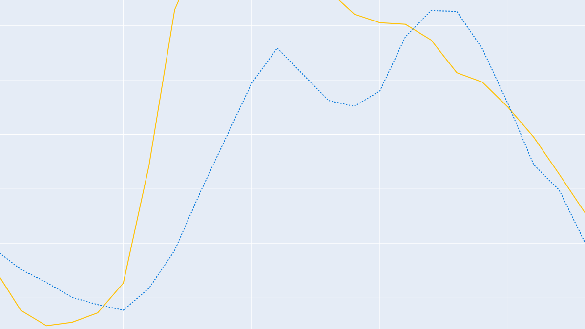
)The colors are from Coloring for Colorblindness by David Nichols. If you want more explicit control over which value is mapped to which color, you can use color_discrete_map, where you input a dictionary. The column entry you want to map should be the dictionary’s key, and the color you want the entry to have, should be the dictionary’s value, in our example:
color_discrete_map = {
    "Friday": "#FFC20A",
    "Saturday": "#0C7BDC"
}
Use a color blindness simulator
A final tip is to check your work using a color blindness simulator, such as Coblis. Coblis lets you view an image file as seen with different color vision impairments. To explore the difference in the color scale, we can simulate color vision weaknesses, blindness and monochromacy. Below is our plot with double encoding and color blindness safe palette as seen with tritanopia (blindness to blue):

These are a few techniques to ensure readers with color vision impairment are able to read your plots! There are many more aspects of accessibility I haven’t covered here, such as sufficient contrast, easily legible fonts, alternative texts, and providing the information in several formats.
Both designing for color vision impairment and color in itself are big topics. If you want to learn more, I recommend:
- Coloring for Colorblindness by David Nichols simulates different color vision impairments, shows a few suggested accessible color palettes and let’s you explore these, and others, with interactivity.
- Subtleties of Color by Richard Simmons is a great introduction to how we perceive color. It is also available as a talk on YouTube.
In the coming parts of this series, we will focus on techniques that play to our visual systems’ strong sides and avoid some common pitfalls.


Leave a Reply