
Using artificial intelligence and statistical methods for prediction the future is very helpful, but not always easy to understand. The ways that models decide on a prediction can be difficult to comprehend for humans. Therefore, it might be difficult to trust a model to make the right decisions, especially if the model is used for operating the electrical grid.
An inevitable fact regarding all models, is that they are always uncertain, to some extent. Prediction intervals answer the important question:
How certain or uncertain is the model?
Imagine a model trying to predict the electricity consumption for some geographical region. Here is an example of a table of predictions, using made up data.
| Datetime | Model predictions | Observations |
| 06.07.2024 00:00 | 4869 | 5023 |
| 06.07.2024 00:15 | 4956 | 4938 |
| 06.07.2024 00:30 | 5001 | 5049 |
| 06.07.2024 00:45 | 5016 | 5056 |
| ….. | ….. | ….. |
One way of evaluating how uncertain the model is, can be to plot the prediction errors (the predictions minus the observations) in a histogram.

A histogram like this can be very informative and tell us a lot about the model. By the looks of it, the prediction errors in this case are normally distributed, with a mean of 0. If the histogram instead looked like this

we would know that the model’s predictions are too high in general, because the histogram is centred at 30. Or if the shape was nothing like a normal distribution, it could indicate model was missing some information.
Assuming that our prediction errors are normally distributed, as in Figure 1, we could calculate prediction intervals for the model predictions. Depending on the use case, we can use either one-sided or two-sided intervals. If it is a one-sided interval, we call the values percentiles. For example, for the 95th percentile, it is expected that 95 % of observations will fall under that value, and the remaining 5 % will be over.
Calculating percentiles
In order to calculate the percentiles, we first get the margin of error and then add that to the predictions.
import numpy as np
from scipy.stats import norm
import pandas as pd
from sklearn import linear_model

## Making mock data and a simple linear regression modell using the last timestep to predict the next.
observations = pd.DataFrame(np.sin(np.linspace(0, 100, 3000)) + np.random.normal(
    loc=0, scale=np.random.uniform(low=1, high=5), size=3000))

model = linear_model.LinearRegression()
model.fit(y=observations[1:2000], X=observations[:2000-1])

predictions = model.predict(observations[2000:])
observations = observations[2000:]

## Calcultating the percentiles
q = 0.05
prediction_errors = predictions - observations
std_errors = prediction_errors.std()
margin_of_error = norm(0, std_errors).ppf(q)
In this particular case, if we assume the standard deviation is 20, the margin of error for the 5th percentile is -32. The 95th percentile can be calculated with the same method. Because the normal distribution is symmetrical, the 95th percentile margin of error is 32. Adding that to the predictions, results in the following table. The 95th and 5th percentile are denoted by P95 and P05 respectively.
| Datetime | Percentile | Prediction |
| 06.07.2024 00:00 | P05 | 4837 |
| 06.07.2024 00:00 | P95 | 4901 |
| 06.07.2024 00:00 | 4869 | |
| 06.07.2024 00:15 | P05 | 4924 |
| 06.07.2024 00:15 | P95 | 4988 |
| 06.07.2024 00:15 | 4956 | |
| …. | …… | …… |
Assuming t-distribution instead
In general, we expect prediction errors to be normally distributed. However, sometimes that assumption might not hold, as was the case in one of our projects in Statnett.
We were given the task of evaluating and potentially improving the existing way of calculating prediction intervals, which was essentially the process described above. After some analysis, it seemed that assuming the prediction errors instead follow a t-distribution could yield better results.
In short, the t-distribution is more flexible than the normal distribution and tends towards a normal distribution as the degrees of freedom tend toward infinity. Here is an example of how the data seemed to fit the (scaled) t-distribution better than the normal distribution, especially in the tails and peak.


One way of fitting the prediction errors to the scaled and shifted t-distribution, is to fit the probability density function (pdf) to a histogram of the errors. In this project, we fitted the cummulative distribution function (cdf) curve to the errors instead. The reason for using curve_fit with the cdf instead, is that the histograms introduce an extra parameter with the bin size and are more sensitive to outliers.
A simplified version of the implemented code is
def fit_t_dist_cdf_curve(difference):
    difference = np.sort(difference)
    y_data = np.linspace(0.0, 1.0, len(difference))
    p_optimal, *_ = curve_fit(t.cdf, xdata=difference, ydata=y_data,
                              p0=[1, 1, 1]))
    degrees_of_freedom, loc_value, scale_value = p_optimal
    return degrees_of_freedom, loc_value, scale_value

q = 0.05
prediction_errors = [predictions-observations]
parameters = fit_t_dist_cdf_curve(prediction_errors)

margin_of_error = stats.t.ppf(q, *parameters)Note that the data is fitted to a t-distribution cdf with parameters df (degrees of freedom), loc (shifting) and scale (scaling). However, it is not a noncentral t-distribution being used, but (the cdf of) a scaled and shifted version of the standard t-distribution. The documentation states that ” Specifically, t.pdf(x, df, loc, scale) is identically equivalent to t.pdf(y, df) / scale with y = (x – loc) / scale”.
Evaluating the prediction intervals
In our project it was necessary to evaluate the different prediction intervals in order to see which one performed the best. We chose to do so using heatmaps.
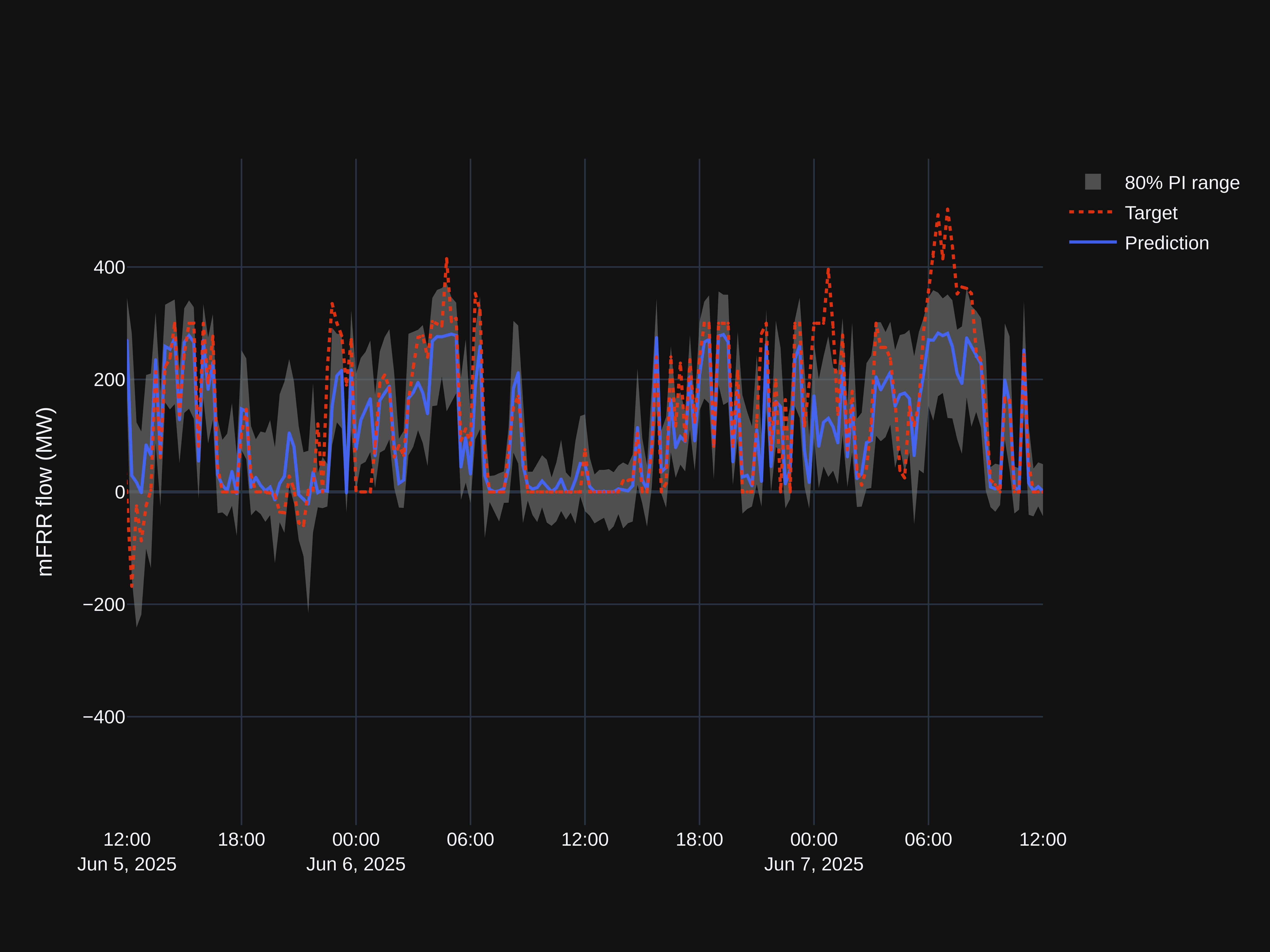
The model we chose to use for comparing the prediction intervals, is a short-term consumption model, predicting the electrical consumption in the five different bid zones in Norway NO1-NO5. For each bid zone, the model produces a forecast every 5 minutes with a 24 timesteps of 5 minutes giving a horizon of 2 hours. This is displayed in a table with 24 columns, where each column represents a timestep of 5 minutes, and every row is a new forecast.
| Datetime | 1 | 2 | 3 | … | 24 |
| 06.07.2024 00:00 | 4869 | 4957 | 4935 | … | 5370 |
| 06.07.2024 00:15 | 4956 | 4938 | 4990 | … | 5377 |
| 06.07.2024 00:30 | 5001 | 5049 | 5034 | … | 5236 |
| 06.07.2024 00:45 | 5016 | 5056 | 5092 | … | 5045 |
| ….. | ….. | ….. | ….. | … | ….. |
Adding in the prediction intervals gives the following table for one bid zone.
| Datetime | Percentile | 1 | 2 | 3 | … | 24 |
| 06.07.2024 00:00 | P05 | 4837 | 4922 | 4892 | … | 5304 |
| 06.07.2024 00:00 | P25 | 4855 | 4940 | 4914 | … | 5330 |
| 06.07.2024 00:00 | P75 | 4883 | 4974 | 4956 | … | 5410 |
| 06.07.2024 00:00 | P95 | 4901 | 4992 | 4978 | … | 5436 |
| 06.07.2024 00:00 | 4869 | 4957 | 4935 | … | 5370 | |
| 06.07.2024 00:15 | P05 | 4924 | 4903 | 4947 | … | 5311 |
| 06.07.2024 00:15 | P25 | 4942 | 4923 | 4969 | … | 5337 |
| 06.07.2024 00:15 | P75 | 4970 | 4952 | 5011 | … | 5317 |
| 06.07.2024 00:15 | P95 | 4988 | 4973 | 5033 | … | 5443 |
| 06.07.2024 00:15 | 4956 | 4938 | 4990 | … | 5377 | |
| …. | ….. | ….. | ….. | ….. | … | ….. |
Using these tables, and a given test period, we counted how many of the observations fell below its target percentile. That resulted in a new table, where for all rows with PO5, the target value is 0.05, for all rows with P25 the target value is 0.25, etc.
| Bid zone | Percentile | 1 | 2 | 3 | … | 24 |
| NO1 | P05 | 0.057 | 0.058 | 0.059 | … | 0.075 |
| NO1 | P25 | 0.225 | 0.224 | 0.226 | … | 0.207 |
| NO1 | P75 | 0.777 | 0.781 | 0.782 | … | 0.817 |
| NO1 | P95 | 0.959 | 0.961 | 0.962 | … | 0.985 |
| NO2 | P05 | 0.041 | 0.039 | 0.038 | … | 0.046 |
| NO2 | P25 | 0.219 | 0.219 | 0.226 | … | 0.229 |
| …. | ….. | ….. | ….. | ….. | … | ….. |
| NO5 | P95 | 0.937 | 0.937 | 0.938 | … | 0.935 |
Using the known target values, we made a heatmap of the absolute value of the difference between the percentile scores and the target values. Therefore, the lower and more blue the value, the better the result. Figure 4 is the heat map when the percentiles were calculated assuming the prediction errors were normally distributed, and figure 5 is the heat map calculated assuming t-distribution.


Visually, it is clear that for this given model and test period, the method using the shifted and scaled t-distribution yielded the best results.
Summary
- Prediction intervals are important because they indicate how certain or uncertain a model is.
- Depending on your assumptions, there are several ways to calculate prediction intervals.
- The t-distribution is more flexible than the normal distribution and gave more precise prediction intervals in our specific case.
Sources
———————————————————


Leave a Reply