How to recruit data scientists and build a data science department from scratch

Our strategy was to build on talent from the business and hire fast learners when we started building a data science department at Statnett two years ago. Now, we have operated for a year with great achievements as well as setbacks and learning points. Read about our story in this post.

About two years ago I was tasked with building a data science team at Statnett, a government owned utility. Interesting data science tasks abounded, but most data science work was done by consultants or external parties as R&D projects. This approach has its merits, but there were two main reasons why I advocated building an in-house data science team:

  • Domain specific knowledge as well as knowing the ins and outs of the company is important to achieve speed and efficiency. An in-house data science team can do a proof of concept in the time it takes to hire an external team. And an external team often needs a lot of time to get to know the data sources and domain before they start delivering. It is also a burden for the few people who teach new consultants the same stuff time and again, they can become a bottleneck.
  • Data science is about making the company more data driven, it is an integral part of developing our core business. If we are to succeed, we must change how people work. I believe this is easier to achieve if you are intimately familiar with the business and are in it for the long haul.

But how to build a thriving data science department from scratch? Attracting top talent can be tough, especially so when you lack a strong professional environment where your new hires can learn and develop their skills.

Build on talent from the business

data_science_venn_diagram
Drew Conway’s Venn Diagram The primary colors of data: hacking skills, math and stats knowledge, and substantive expertise

Prior to establishing the data science team, I lead a team of power system analysts. These analysts work in the department for power system planning, which has strong traditions for working data driven. Back in 2008 we adopted Python to automate our work with simple scripts; we didn’t use version control or write tests. Our use of Python grew steadily and eventually we hired a software development consultant to aid in the development and help us establish better software development practices.

This was long before I was aware that there was anything called data science and machine learning. However, the skillset we developed – a mix of coding skills, domain expertise and math – is just what Drew Conway described as the “primary colors” of data science in his now famous Venn diagram from 2010.

20180721_STC872
Even the Economist commented on the rise of Python in a 2018 article.

A background as an analyst with python skills proved to be a very good starting point for doing data science. The first two data scientists in Statnett came from the power system analysis department. I guess we were lucky to have started coding python back in 2008, as this coincided perfectly with the rise of python as the programming language for doing data science.

Still, most large companies have some sort of business analyst function, and this is a good place to find candidates for data science jobs. Even if they are unfamiliar with (advanced) coding, you get people that already know the business and should know basic math and statistics as well.

Hire for aptitude rather than skill

Having two competent analysts to kickstart the data science department also vastly improved our recruitment position. In my experience it is important for potential hires to know that they will have competent colleagues and a good work environment for learning. Therefore, Øystein, one of the “analyst-turned-data scientists”, attended all interviews and helped develop our recruitment strategy.

Basically, our strategy was to hire and develop fast learners, albeit with some background in at least two of the “bubbles” from the Venn diagram. Preferably the candidates should have complementary backgrounds. E.g. some strong coders, some more on the statistics side and some with a background in power systems.

We deliberately didn’t set any hard skill requirements for applicants. Requiring experience in machine learning or power systems would have narrowed the field down too much. Also, the technical side of data science is in rapid development. What is in vogue today, will be outdated in a year. So, it makes more sense to hire for aptitude rather than look for certifications and long experience with some particular technology. This emphasis on learning is also more attractive for the innovative talent that you need in a data science position.

6971

Use interview-cases with scoring to avoid bias

During the first four months we conducted about 60 interviews with potential candidates. I had good experience using tests and cases in previous interview situations. First off, this forces you to be very specific about what you are looking for in a candidate and how to evaluate this. Secondly, it helps to avoid bias if you can develop an objective scoring system and stick to it. Thirdly, a good selection of tailored cases (not standard examples from the internet) serves to show off some interesting tasks that are present in the company. We used the ensuing discussions to talk about how we approached the cases in our company, thus advertising our own competence and work environment.

Such a process is not without flaws. Testing and cases can put some people off, and you are at risk of evaluating how candidates deal with a stressful test situation rather than how they will perform at work. Also, expect to spend a lot of time recruiting. I still think the benefits clearly outweigh the downsides. (Btw, maybe an aspiring data scientist should expect a data drive recruitment process).

We ended up with a set of tasks and cases covering:

  • Basic statistics/logic
  • Evaluate a data science project proposal
  • How to communicate a message with a figure
  • Statistical data visualization
  • Coding skills test (in language of choice)
  • Standardized aptitude tests

We did two rounds of interviews and spent about 4 hours in total per candidate for the full test set. In addition, some of the cases were prepared beforehand by the candidate. The cases separated well and in retrospect there was little need for adjustments. In any case, it would have been problematic to change anything once we started: How you explain the tasks, what hints you give etc. should be consistent from candidate to candidate.

Focus on a few tasks at a time

The first year of operation has necessarily been one of learning. Everyone has had to learn the ropes of our new infrastructure. We have recently started using a Hadoop stack for our streaming data and data at rest. And we have been working hard to get our CI/CD pipelines working and learning how to deploy containerized data science application on Open Shift.

Even though the team has spent a lot of time learning the technology and domain, this was as expected. I would say the major learning point from the first year is one of prioritization: We took on too many tasks at once and we underestimated the effort of getting applications into production.

As I stated initially, interesting data science tasks abound, and it is hard to say no to a difficult problem if you are a data scientist. When you couple this with a propensity to underestimate the effort needed to get applications into production (especially on new infrastructure for the first time), you have a recipe for unfinished work and inefficient task switching.

So, we have made adjustments along the way to focus on fewer tasks and taking the time needed to complete projects and get them in production. However, this is a constant battle; there are always new proposals/needs/problems from the business side that are hard to say no to. At times, having a team of competent data scientists feels like a double-edged sword because there are so many interesting problems left unsolved. Setting clear goals and priorities, as simple as that sounds, is probably where I can improve the most going forward.

Vernerunde Viklandet 2018

Get strong business involvement

I would also stress that it is paramount to have strong presence from the business side to get your prioritizations right and to solve the right problem. This holds for all digital transformation, when in my experience, the goal often has to be adjusted along the way. The most rewarding form of work is when our deliveries are continuously asked for and the results critiqued and questioned.

On the other hand, one of the goals with the data science department was to challenge the business side to adopt new data driven practices. This might entail doing proof of concepts that haven’t been asked for by the business side to prove that another way of operating is viable.

It can be difficult to strike the right balance between the two forms of work. In retrospect we spent too much time initiating our own pilot projects and proof of concepts in the beginning. While they provide ample learning opportunities – which was important during our first year – it is hard to get such work implemented and it is a real risk that you solve the wrong problem. A rough estimate therefore is that about 80 % of our work should be initiated by and led by the business units, with the representative from the data science team being an active participator, always looking for better ways to solve the issues at hand.

Scaling data science competency

From the outset, we knew that there would be more work than a central data science department could take on. Also, to become a more data-driven organization, we needed to develop new skills and a new mindset throughout the company, not only in one central department.

Initially we started holding introductory Python classes and data science discussions. We had a lot of colleagues who were eager to learn, but after a while it became clear that this approach had its limits. The lectures and classes were inspiring, but for the majority it wasn’t enough to change they way they work.

That’s why we developed a data science academy: Ten employees leave their work behind for three months and spend all their time learning about data science. The lectures and cases are tailored to be relevant for Statnett and held mainly by data scientists. The hope is that the attendees learn enough to spread data science competence in their own department (with help from the us). In such a way we hope to spread data science competency across the company.

What have we achieved?

At times I have felt that progress was slow. Challenges with data quality have been ubiquitous. Learning unfamiliar technology by trial and error has brought development to a standstill. Very often, projects that we think are close to production ready have weeks left of work. This has coined the term “ten minutes left” meaning an unspecified amount of work, often weeks or months left.

But looking back, the accomplishments become clearer. There is a saying that “people overestimate what can be done in the short term, and underestimate what can be done in the long term” which applies here as well.

Some of the work that we have done builds on ideas from our time working on reliability analysis in power systems and is covered here on this blog:

The largest part of our capacity during the last year has been spent on building forecasts for system operation:

We have also spent a considerable effort on communication, both to teach data science to new audiences at Statnett, exchange knowledge and to promote all the interesting work that happens at Statnett. This blog, scientific papers, our data science academy and talks at meetups and conferences are examples of this.

How we quantify power system reliability

An important aspect of digital transformation for a utility company is to make data-driven decisions about risk. In electric power systems, the hardest part in almost any decision is to quantify the reliability of supply. That is why we have been working on methodology, data quality and simulation tools with this in mind for several years at Statnett. This post describes our simulation tool for long-term probabilistic reliability analysis called MONSTER.

The need for reliable power system services is ever increasing in our system as  technology advances. At the same time, the focus on carefully analysed and socio economic profitable investments has perhaps never been more essential. In light of this, several initiatives focus on having probabilistic criteria as the frame for doing reliability analysis. This post describes our Monte Carlo simulation tool for probabilistic power system reliability analysis that we have dubbed MONSTER.

Model overview

holisticOur simulation methodology is described in this IEEE PMAPS paper from 2018: A holistic simulation tool for long-term probabilistic power system reliability analysis (you need IEEE Xplore membership to access the article)

Here I’ll repeat the basics, ingnore most of the maths and expand on some details that have been left out in the paper.

Our tool consist of two main parts: A Monte Carlo simulation tool and a Contingency analysis module. The main idea in the simulation part is to use hourly times series of failure probability for each component.

We do Monte Carlo simulations of the power system where we draw component failure times and durations, and then let the Contingency analysis module calculate the consequence of each of these failures. The Contingency evaluation module is essentially a power system simulation using optimal loadflow to find the appropriate remedial actions, and the resulting “lost load” (if any).

The end result of the whole simulation is typically expressed as expected loss of load, expected socio-economic costs or distributions of the same parameters. Such results can, for instance, be used to make investment decisions for new transmission capacity.

Time series manager

The main principle of the Time series manager is to first use failure observations to calculate individual failure rates for each component by using a Bayesian updating scheme, and then to distribute the failure rates in time by using historical weather data.  We have described the procedure in detail in a previous blog post.

We first calculate individual, annual failure rates using observed failure data in the power system. Then for each component we calculate an hourly time series for the probability of failure. The core step in this approach is to calculate the failure probabilities based on reanalysis weather data such that the resulting expected number of failures is consistent with the long term annual failure rate calculated in the Bayesian step. This is about spreading the failure rate in time such that we get one probability of failure at each time step. In this way, components that experience the same adverse weather will have elevated probabilities of failure at the same time. This phenomenon is called failure bunching and it’s effect is illustrated in the figure below. In fact we will get a consistent and realistic geographical and temporal development of failure probabilities throughout the simulation period.

failurebunching
Failure bunching dramatically increases the probability of multiple independent failures happening at the same time.

In our model we divide each fault into eight different categories: Either the fault is  temporary or Permanent, and each of the failures can be due to either wind, lightning, snow/icing or unrelated to weather. Thus, for each component we get eight historical time series to be used in the simulations.

outages temporary failures

Biases in the fault statistics

There are two data sources for this part of the simulation. Observed failure data from the national fault statistics database FASIT, and approximately 30 years of reanalysis weather data calculated by Kjeller Vindteknikk.  The reanalysis dataset is nice to work with from a data science perspective. As it is simulated data, there are no missing values, no outliers, uniform data quality etc.

The fault statistics, however, has lots of free text columns, missing values and inconsistent reporting (done by different people across the nation over two decades). So a lot of data prep is necessary to go from reported disturbances to statistics relevant for simulation. Also, there are some biases in the data to be aware of:

  • There is a bias towards too long repair/outage-times. This happens because most failures don’t lead to any critical consequences, therefore we spend more time than strictly necessary repairing the component or otherwise restoring normal operation. For our simulation we want the repair time we would have needed in case of a critical failure. We have remedied this to some extent by eliminating some of the more extreme outliers in our data.
  • There is a bias towards reporting too low failure rates; only failures that lead to an immediate disturbance in the grid count as failures in FASIT. Failures that lead to controlled disconnections are not counted as failures in this database, but are  relevant for our simulations if the disconnection is forced (as opposed to postponable).

The two biases counteract each other, in addition this kind of epistemic uncertainty is possible to mitigate by doing sensitivity analysis.

Improving the input-data: Including asset health

Currently, we don’t use component specific failure rates. For example, all circuit breakers have the same failure rate regardless of age, brand, operating history etc. For long term simulations (like new power line investment decisions) this is a fair assumption as components are regularly maintained and swapped out as time passes by.

The accuracy of the simulations, especially on short to medium term, can be greatly improved by including some sort of component specific failure rate. Indeed, this is an important use-case in and by itself for risk based asset maintenance.

Monte Carlo simulation

A Monte Carlo simulation consist of a large number of random possible/alternative realizations of the world, typically on the order of 10000 or more. In our tool, we do Monte Carlo simulations for the time period where we have weather data, denoted by k years, where k~=30. For each simulation, we first draw the number N of failures in this period for each component and each failure type. We do this by using the negative binomial distribution. Then we distribute these failures in time by drawing with replacement from the k∗8760 hours in the simulation period such that the probability of drawing any particular hour is in proportion to the time series of probabilities calculated earlier. As the time resolution for the probabilities is hourly, we also draw a uniform random value of the failure start time within an hour. Then finally, for each of these failures we draw random duration of outages:

[code]
for each simulation do
for each component and failure type in study do
draw the number N of failures
draw N failures with replacement
for each failure do
draw random uniform start time within hour
draw duration of failure
[/code]

feilrater
Convergence of the most and least frequent single- and double failure rates for the first 1000 simulations.

Outage manager

In addition to drawing random errors, we also have to incorporate maintenance planning. This could for example be done either as an explicit manual plan or through an optimization routine that distributes the services according to needs and probabilities of failure.

How detailed the maintenance plan is modeled, typically depends on the specific area of study. In some areas, the concern is primarily of a failure occurring during a few peak load hours when margins are very tight. At such times it is safe to assume that there is no scheduled maintenance – and we disregard it entirely in the model. In other areas, the critical period might be when certain lines are out for maintenance, and so it becomes important to model maintenance realistically.

For each simulation, we step through points in time where something happens and collect which components are disconnected. In this part we also add points in time where the outage pass some predefined duration, called outage phase in our terminology. We do this to be able to apply different remedial measures depending on how much time has passed since the failure occurred. The figure below illustrates the basic principles.

outagephases
Collecting components and phases to contingency list. Dashed line indicate phase 1 and solid line phase 2. In this example the two outages contribute to five different contingencies. In phase 1, only automatic remedial measures (like system protection) can be applied. In phase 2, manual measures, like activation of tertiary reserves can be applied.

One important assumption is that each contingency (like the five contingencies in the figure above) can be evaluated independently. This makes the contingency evaluation, which is the computationally heavy part, embarrassingly parallel. Finally, we eliminate all redundant contingencies. We end up with a pool of unique contingencies that we send to the Contingency Analysis module for load flow calculations in order to find interrupted power.

Contingency analysis

Our task in the Contingency analysis module is to mimic the system operator’s response to failures. This is done in four steps:

  1. Fast AC-screening to filter out contingencies that don’t result in any thermal overloads. If overloads, proceed to next step.
  2. Solve the initial AC load-flow, if convergence move to next step. In case of divergence (due to voltage collapse) attempt to emulate the effect of voltage collapse with a heuristic, and report the consequence.
  3. Apply remedial measures with DC-optimal load-flow, report all measures applied and go to next step.
  4. Shed load iteratively using AC load-flow until no thermal overloads remain. Report lost load.

In step 3 above, there are many different remedial measures that can be applied:

  • Reconfiguration of the topology of the system
  • Reschedule production from one generator to another
  • Reduce or increase production in isolation
  • Change the load at given buses

For the time being, we do not consider voltage or stability problems in our model apart from the rudimentary emulation of full voltage collapse. However, it is possible to add system protection to shed load for certain contingencies (which is how voltage stability problems are handled in real life).

As a result from the contingency analysis, we get the cost of applying each measure and the interrupted power associated with each contingency.

Load flow models and OPF algorithm

Currently we use Siemens PTI PSS/E to hold our model files and to solve the AC load flow in steps 1,2 and 4 above. For the DC optimal load-flow we express the problem with power transfer distribution factors (PTDF) and solve it as a mixed integer linear program using a commercial solver.

Cost evaluation – post-processing

Finally, having established the consequence of each failure, we calculate the socio-economic costs associated with each interruption. This is done by following the Norwegian regulation. The general principle is described in this 2008 paper, but the interruption costs have been updated since then. For each failure, we know where in the grid there are disconnections, for how long they last, and assuming we know the type of users connected to the buses in our load-flow model, the reliability indices for different buses will be easy to calculate. Due to the Monte Carlo approach, we will get a distribution of each of the reliability indices.

risk_matrix_mwh
Result example: Failure rate and lost load averaged over alle simulation for some contingencies (black dots).

A long and winding development history

MONSTER has been in development for several years at Statnett after we did an initial study and found that no commercial tools where available that fit the bil. At first we developed two separate tools: one Monte Carlo simulation tool in Matlab, used to find the probability of multiple contingencies, and an Python AC contingency evaluation module built on top of PSS/E, used to do contingency analysis with remedial measures. Both tools were built to solve specific tasks in the power system analysis department. However, combining the tools was a cumbersome process that involved large spreadsheets.

At some point, we decided to do a complete rewrite of the code. The rewriting process has thought us much of what we know today about modern coding practices (like 12-factor apps), and it has helped build the data science team at Statnett. Now, the backend is written in python, the front end is a web-app built around node.js and vue, and we use a SQL database to persist settings and results.

skjermbilde-stasjon.jpg
A screenshot from the application where the user defines substation configuration.

Simulating power markets with competitive self-play

In this post we present an unpublished article from 2009 that uses self-play to evolve bidding strategies in congested power markets with nodal pricing.

Reinforcement learning using self-play is currently one of the most fascinating areas of research within artificial intelligence. Papers like Mastering Chess and Shogi by Self-Play with a General Reinforcement Learning Algorithm makes for inspiring reading, and I’m sure we’ll see a host of real world applications in the future. These current trends in reinforcement learning came to mind as an old piece of unpublished research I wrote surfaced some weeks ago. In the article I used a genetic algorithm (GA) – all the rage back in 2009 – to learn the weights in a neural network which provide the strategy for competitive generator companies in a simulated power market. Using this setup I could demonstrate well known Nash equilibria (NE) in common market situations, as well as simulate competition in intractable market setups.

I wrote the article while I worked as a scientific researcher at Sintef Energy AS back in 2009 and the work was financed by Sintef. Also, the topic is not that interesting to pursue as a TSO, however the methods proved interesting enough to write a post about it here. Thanks to Sintef for letting me publish it here!

The entire article draft can be downloaded here

The market participants

The paper starts off with a description of market participants (generators). The generators must bid their capacity into the power exchange. Each generator can behave strategically by adding a markup to the marginal cost, thereby attempting to achieve a higher profit, but at the risk of losing market shares. The markup is the output of the neural network which we will come to.

fig1

For convenience we use a linear marginal cost function with a scalar markup.

Nodal pricing and market clearing

The power exchange collects all the market participant’s bids (this includes demand). It then has to find the intersection of the aggregate supply and demand curves while taking transmission constraints into account. In other words, the power exchange must find the generation by all generators that minimizes the system cost. With linear bids and a linearized version of the power flow equations, this is a quadratic optimization problem.

The problem formulation implies that each node in the power system can have a unique power price (if there are constraints in the network).  The nodal power prices are inferred from the Lagrangian multipliers of the equality constraints; the Lagrangians are the costs of producing one additional MW of energy at a node. This setup roughly reflects several real world power markets.

To solve this quadratic optimization problem we can employ what is called a DC optimal power flow. The Python package pypower handles all this for us. A limited amount of coding should let you add a variable markup to each generators marginal cost function.

After the market is cleared, each participant gets paid the price at the node that it resides, even if it was consumed at a node with a different price. Profit from trade between differently priced nodes, congestion rent, devolves to the system operator.

Evolving strategies using a genetic algorithm

The genetic algorithm (GA) is used to evolve strategies for the market participants. Each market participant has its own pool of n strategies that are evolved using the GA. The aim of each participant is to maximize its profits.

At each generation g of the simulation the participants meet several times, these are the iterations. At each iteration, each participant randomly selects a strategy from its pool of strategies. This strategy is evaluated to yield a bid B_u that is submitted to the market clearing algorithm. The market clearing returns participants profits that are stored in memory. After the desired number of iterations have passed, the fitness of a strategy, s, for unit, u, at generation, g, F_{u,s,g}, is calculated as the sum of profits it received divided by the number of times it was played. Thereafter, selection, crossover, and mutation are applied to produce the new generation of strategies and a new generation is started.

In pseudocode:

  1. Initialize and load power system structure, g = 0
  2. g = g + 1, i = 0
  3. i = i + 1
  4. For each participant u, select a random strategy s from the pool
  5. Find the bid of each participant B_u, given the random strategy
  6. Evaluate the market clearing algorithm given the bids of all players and store the achieved profits
  7. If i < numIterations goto line (3), else:
  8. Calculate the fitness of each strategy F_{u,s,g} as the average of all profits received this generation
  9. Perform selection, crossover and mutation of all strategies
  10. If g < numGenerations goto line (2)
  11. Simulation ends

The number of iterations is selected such that all strategies are played on average ten times each generation. In this paper, the standard number of strategies for each participant was n = 50. In other words, there were 500 iterations per generation.

Representing the strategy as a neural network

A strategy is the rule by which the participants determine their bid, in this case the markup. In mathematical terms, a strategy is a function that takes a set of inputs and returns a decision (markup). This function has parameters that determine the nature of the relationship between inputs and output; it is these parameters that the GA work upon.

Inspired by research on the Iterated Prisoner’s Dilemma (IPD), the inputs to the strategy are taken to be the markup and the price attained when the strategy was last played. The loose resemblance to an IPD, is that the markup is one’s own level of cooperation and the price corresponds to the cooperative level of the competitor(s). Using these two inputs, the strategy essentially has a memory of one round and is able to evolve tit-for-tat strategies and similar, i.e. if you bid high last turn I also continue to bid high this turn. The amount of information taken as input could easily be extended to allow for more sophisticated strategies, maybe this could be an area for recurrent neural networks.

A convenient way of creating a parametrized function, that can represent a strategy as described above, is a multilayer feed-forward neural network. It can approximate any function arbitrarily well, given sufficient neurons. In the article I used a small neural network with one hidden layer. The weights and biases in the neural network were then evolved using the genetic algorithm. A modern approach would maybe use deep q-learning or a similar approach instead.

Perfect competition and co-operative equilibria

The model is primarily used to set up market situations that model classical game theory situations which have been analyzed extensively in the literature. The idea is to show that self-play converges to well-known Nash-equilibria (NE).

The first part of the article shows some rather obvious results:

  • In a market with a lot of small generators and a surplus of capacity, the markup converges to zero
  • In a duopoly where each generator can serve exactly half the load, the markup converges to the highest allowed markup
  • In a duopoly where one generator alone can serve the load (Bertrand competition), the markup converges to zero

Conceptually, Bertrand competition bears some resemblance to the Prisoners Dilemma (IPD): If both generators co-operate by bidding high they get a good profit, however, it is always in the interest of the other to defect and bid marginally lower, thus mutual defection is ensured. In the IPD game it is known that players can evolve strategies that maintain a mutually cooperative level even though the equilibrium for both players is to defect if the game is played only once. In the normal IPD, there are only two choices, either full cooperation or full defection. A common extension of the game is to include several discrete levels of cooperation.

fig5
Market price in Bertrand competition for an initially random population (A), defecting population (B), and co-operative population (C). In all simulations, the marginal cost is 100, and the markup is eventually reduced to zero.

In a paper on the IPD from 2002, the authors noted that the chance of mutual cooperation dwindled as the possible choices in the IPD increased. Considering that each player in the Bertrand game can select any real positive number as her price (which can be thought of as the levels of cooperation), it is simply very unlikely to remain at a mutually cooperative level. This effect can explain why mutual cooperation is likely if the choice of each player is limited to only a few discrete price levels, but highly unlikely if the price can be selected from a continuum.

Other papers on agent based modelling limit the agents to select from a discrete set of choices. If the market situation resembles Bertrand competition, the above discussion might lead to think that mutual co-operation can occur, albeit with a small probability if the number of choices is large. However, it turns out that the similarity of the Bertrand and Prisoners Dilemma game disappears if the number of choices is limited. In fact, the outcome of simulated Bertrand competition with discrete levels of cooperation is quite arbitrary and depends on the exact markups the players can choose from.

Competition with capacity constraints

With capacity constraints, one generator alone can not serve the entire market like in Bertrand competition. The participant that bids higher than its opponent still captures some residual demand. A market player can thus follow two strategies:

  1. Try to undercut the other player to get a large market share and risk low prices, or
  2. set the markup high to make sure the market clearing price remains high and accept that the other player gets the larger market share.

In this case there exists a price where a market player is indifferent as to which direction it should diverge as long as the opponent sticks to its price. The price of indifference occurs when undercutting the opponent gives the exact same profit as bidding higher than the opponent and capturing the residual demand.

The price of indifference depends on the exact market setup. In the simulation below, the price of indifference was 160. The bid of player 1 stays high (to maximize profits) while the bid of player 2 stays below the threshold of 160. Due to random mutation in the genetic algorithm, the values don’t stabilize entirely. Who ends up as the high bidder, and thus worse of, is entirely random.

fig7
The two players undercut one another until, at the threshold price, player 1 starts increasing its markup.

Duopoly in a congested two-bus network

So far, the underlying electrical network has been kept uncongested to enable analysis of some well known economic games. In this section, the simplest possible constrained network will be analysed theoretically and simulated with the developed model. The network is depicted in the figure below. It consists of two buses with a generator and load each; the buses are connected by a transmission line capable of transferring K MW in either direction.

fig9
Two bus network with constrained transmission capacity

Moreover, the transmission capacity K is less than the demand at either of the buses and the generators are capable of serving the load at their own bus and at the same time utilize the entire transmission capacity.

Accordingly, the generators face a strategic choice:

  1. Bid high to raise the price at its bus and serve the load that the opponent cannot capture because of the limited transmission capacity; or,
  2. Bid low and serve all the load it possibly can cover.

At fi rst, this might seem like the Bertrand game with capacity constraints. However, there is one important difference: since the generators are paid the nodal price (and not a common system price), the low bidder can profitably raise its price towards that of the high bidder. The consequence is that there is no NE in pure strategies, resulting in a cyclical variation in the price over the course of a simulation.

fig11
Simulated markups in the two-bus network for 4 different transmission capacity levels K

Competition in a meshed and congested grid

This section presents results from an analysis of a small benchmark power system presented in a paper on agent based modelling. There are 3 strategically behaving generators in the system and all load is assumed to to be completely inelastic. All transmission lines are assumed to have sufficient transmission capacity with the exception of the line from bus 2 to bus 5 which is limited to 100 MW.

fig12
Power system diagram. The numbers close to the lines are reactances in per unit.
tab1
Generator data

The authors in the original paper analytically computed the NE and simulated the system using adaptive agents with a discrete set og markups. Two symmetrical NE were found; generator 3 should always bid its highest markup while either generator 1 or 2 bids with the highest markup and the other bids its marginal cost. The agent-based approach did discover the NE, but alternated between the two equilibria in a cyclical fashion. Here, the markups can be any real number on the interval [0; 30], otherwise the simulation setup is identical to that of the original work.

I find the same NE, however no cyclical behavior occurs. As soon as the agents have locked in on one NE the game stays in that equilibrium for the rest of the simulation. To discover several equilibria, the model must be rerun with random initial conditions.

fig13
Simulated markups for the three generators and corresponding consumer benefit, producer benefit and congestion rent on the right

The figure above shows simulated simulated markups on the left and the corresponding consumer benefit (about 2500), producer bene fit (15000) and congestion rent on the right. If all producers had bid according to their marginal cost, we would have achieved the socially optimal solution, which has producers benefit at 1056, and consumers benefit at 17322. Accordingly there has been a large transfer of benefit from consumers to producers due to market power.

If we double the capacity on the line between bus 2 and 5, market power is mostly eradicated. In addition, the total economic benefit to society increases slightly.

Ideas for further work

Even with the simple setup used in this work it is possible to evolve interesting strategies. However, the field of reinforcement learning has evolved a lot since 2009. One idea for further development would be to re-implement the ideas presented here using modern frameworks for reinforcement learning like open Ai gym and Tensorforce. Such a setup could possibly be used to evolve cooperative strategies with longer memory as well as simulate time-varying market situations (like in the real world).


Comparing javascript libraries for plotting

After some research on available javascript libraries for plotting we decided that plotly fits our needs the best. We also provide a small vue-wrapper for plotly.

Plotly.js renders fast and has a large selection of visualizations

We frequently plot quite large amounts of data and want to be able to interact with the data without long wait times. I use the term large data, and not big data, since we are talking about a typical dataset size on the order of some 100k datapoints. This is not really big data, but it is still large enough that many plotting packages have trouble with rendering, zooming, panning etc. Ideally we would like render times below about 500 ms.

To find the ideal plotting package we set up a small test with some promising plotting packages: Echarts, Highcharts, Plotly and Bokeh. We plotted around 300k datapoints from a timeseries and noted the render times in ms. The chart below displays the render times in milliseconds from five repetitions.Echarts and bokeh are canvas based, and render much slower than the other packages which are SVG based.

Additionally, we find our selves wanting a large selection of visualization types. Classic bar chart, line charts etc. just is not enough. Incidentally, plotly also offers a wide range of charts. Plotly is also available as a python and R package so we can build experience in one plotting package independently of programming language.

Vue-wrapper for plotly

One of our main front-ends uses the vue.js framework. To integrate plotly cleanly we created a vue-wrapper for plotly. Check it out on github:

A vue wrapper for plotly.js chart library
https://github.com/statnett/vue-plotly
29 forks.
117 stars.
38 open issues.

Recent commits:


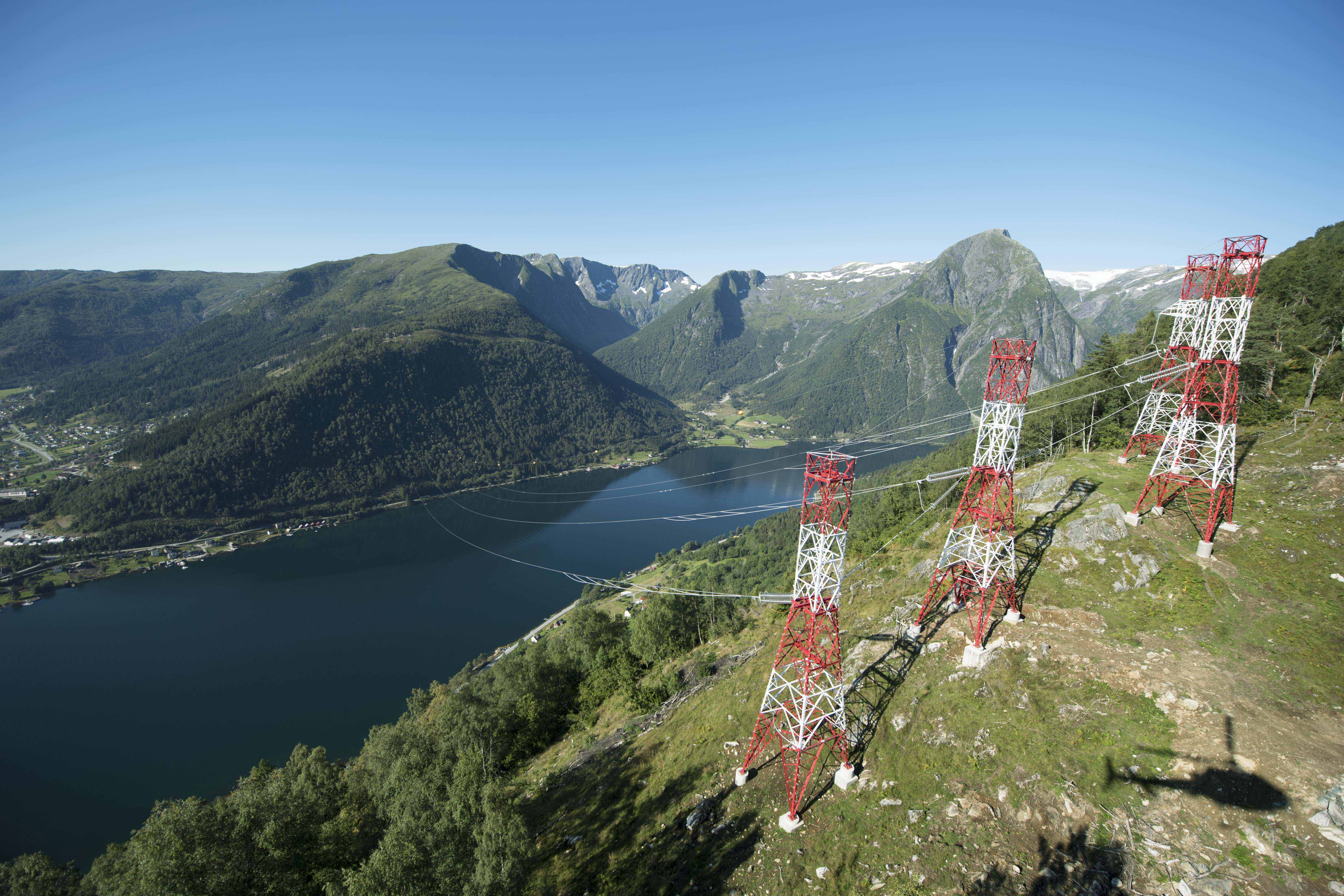
Estimating the probability of failure for overhead lines

In Norway, about 90 percent of all temporary failures on overhead lines are due to weather. In this post, we present a method to model the probability of failures on overhead lines due to lightning.

Welcome to the blog for Data Science in Statnett, the Norwegian electricity transmission system operator. We use data science to extract knowledge from the vast amounts of data gathered about the power system and suggest new data-driven approaches to improve power system operation, planning and maintenance. In this blog, we write about our work. Today’s topic is a model for estimating the probability of failure of overhead lines.

Knowing the probability of failure is central to reliability management

For an electricity transmission system operator like Statnett, balancing power system reliability against investment and operational costs is at the very heart of our operation. However, a more data-driven approach can improve on the traditional methods for power system reliability management. In the words of the recently completed research project Garpur:

Historically in Europe, network reliability management has been relying on the so-called “N-1” criterion: in case of fault of one relevant element (e.g. one transmission system element, one significant generation element or one significant distribution network element), the elements remaining in operation must be capable of accommodating the new operational situation without violating the network’s operational security limits.

Today, the increasing uncertainty of generation due to intermittent energy sources, combined with the opportunities provided e.g. by demand-side management and energy storage, call for imagining new reliability criteria with a better balance between reliability and costs.

In such a framework, knowledge about failure probabilities becomes central to power system reliability management, and thus the whole planning and operation of the power system. When predicting the probability of failure, weather conditions play an important part; In Norway, about 90 percent of all temporary failures on overhead lines are due to weather, the three main weather parameters influencing the failure rate being wind, lightning and icing. In this post, we present a method to model the probability of failures on overhead lines due to lightning. The full procedure is documented in a paper to PMAPS 2018. In an upcoming post we will demonstrate how this knowledge can be used to predict failures using weather forecast data from met.no.

Data sources: failure statistics and weather data

Statnett gathers failure statistics and publishes them annually in our failure statistics. These failures are classified according to the cause of the failure. For this work, we considered 102 different high voltage overhead lines. For these there have been 329 failures due to lightning in the period 1998 – 2014.

We have used renanalysis weather data computed by Kjeller Vindteknikk. These reanalysis data have been calculated in a period from january 1979 until march 2017 and they consist of hourly historical time series for lightning indices on a 4 km by 4 km grid. The important property with respect to the proposed methods, is that the finely meshed reanalysis data allows us to use the geographical position of the power line towers and line segments to extract lightning data from the reanalysis data set. Thus it is possible to evaluate the historical lightning exposure of the transmission lines.

Lightning indices

The first step is to look at the data. Lightning is sudden discharge in the atmosphere caused by electrostatic imbalances. These discharges occur between clouds, internally inside clouds or between ground and clouds. There is no atmospheric variable directly associated with lightning. Instead, meteorologists have developed regression indices that measure the probability of lightning. Two of these indices are linked to the probability of failure of an overhead line. The K-index and the Total Totals index. Both of these indices can be calculated from the reanalysis data.

figur1
Figure 1 Rank and K index for lightning failures

Figure 1 shows how lightning failures are associated with high and rare values of the K and Total Totals indices, computed from the reanalysis data set. For each time of failure, the highest value of the K and Total Totals index over the geographical span of the transmission line have been calculated, and then these numbers are ranked among all historical values of the indices for this line. This illustrates how different lines fail at different levels of the index values, but maybe even more important: The link between high index values and lightning failures is very strong. Considering all the lines, 87 percent of the failures classified as “lightning” occur within 10 percent of the time. This is promising…

figur3
Figure 2: TT index versus K index shows seasonality trend

In Norway, lightning typically occurs during the summer in the afternoon as cumulonimbus clouds accumulate during the afternoon. But there is a significant number of failures due to thunderstorms during the rest of the year as well, winter months included. To see how the indices, K and T T , behave for different seasons, the values of these two indices are plotted at the time of each failure in Figure 3. From the figure it is obvious, though the data is sparse, that there is relevant information in the Total Totals index that has to be incorporated into the probability model of lightning dependent failures. The K index has a strong connection with lightning failures in the summer months, whereas the Totals Totals index seems to be more important during winter months.

Method in brief

The method is a two-step procedure: First, a long-term failure rate is calculated based on Bayesian inference, taking into account observed failures. This step ensures that lines having observed relatively more failures and thus being more error prone will get a relatively higher failure rate. Second, the long-term annual failure rates calculated in the previous step are distributed into hourly probabilities. This is done by modelling the probabilities as a functional dependency on relevant meteorological parameters and assuring that the probabilities are consistent with the failure rates from step 1.

Bayesian update

From the failure statistics we can calculate a prior failure rate \lambda due to lightning simply by summing the number of failures per year and dividing by the total length of the overhead lines. We then arrive at a failure rate per 100 km per year. This is our prior estimate of the failure rate for all lines.

When we observe a particular line, the failures arrive in what is termed a Poisson process. When we assume that the failure rate is exponentially distributed, we arrive at a convenient expression for the posterior failure rate \lambda^B:

\lambda^B = \frac{1 + \sum{y_i}}{\frac{1}{\lambda} + n}

Where n is the number of years with observations, \lambda is the prior failure rate and y_i is the number of observed failures in the particular year.

bayes
Figure 3: The prior and the posterior distribution. Dashed vertical lines are the
expectations.

Distributing the long term failure rates over time

We now have the long-term failure rate for lightning, but have to establish a connection between the K-index, the Totals Totals index and the failure probability. The goal is to end up with hourly failure probabilities we can use in monte-carlo simulations of power system reliability.

The dataset is heavily imbalanced. There are very few failures (positives), and the method has to account for this so we don’t end up predicting a 0 % probability all the time. Read a good explanation of learning from imbalanced datasets in this kdnuggets blog.

Many approaches could be envisioned for this step, including several variants of machine learning. However, for now we have settled on an approach using fragility curves which is also robust for this type of skewed/biased dataset.

A transmission line can be considered as a series system of many line segments between towers. We assume that the segment with the worst weather exposure is representable for the transmission line as a whole.

We then define the lightning exposure at time t:

w^t = \alpha_K \max(0, K^t_{max} - K_{\text{thres}})^2 + \alpha_{TT} \max(0, TT^t_{max} - TT_{\text{thres}})^2

Where \alpha_K, \alpha_{TT} are scale parameters, K_{max}^t is the maximum K index along the line at time t, TT_{max}^t is the maximum Total Totals index at time t along the line. K_{\text{thres}}, TT_{\text{thres}} are threshold values for the lightning indices below which the indices has no impact on the probability.

Each line then has an probability of failure at time t given by:

p_L^t = F(w^t; \sigma_L, \mu_L)

where F(\cdot) is the cumulative log normal function.

To find the standard deviation and expected value that describe the log normal function, we minimize the following equation to ensure that the expected number of failures equals the posterior failure rate:

\mu_L, \sigma_L = \underset{\mu, \sigma}{\text{argmin}} \: g(p^t_L; \mu, \sigma)

where

g(p^t_L; \mu, \sigma) = \left(\lambda^B - \frac{1}{k}\sum_{t=0}^T p^t_L\right)^2

If you want to delve deeper into the maths behind the method we will present a paper at PMAPS 2018.

Fitting the model to data

In this section simulation results are presented where the models have been applied to the Norwegian high voltage grid. In particular 99 transmission lines in Norway have been considered, divided into 13 lines at 132 kV, 2 lines at 220 kV, 60 lines at 300 kV and 24 lines at 420 kV. Except for the 132 and 220 kV lines, which are situated in Finnmark, the rest of the lines are distributed evenly across Norway.

The threshold parameters K_{\text{thres}} and TT_{\text{thres}} have been set empirically to K_{\text{thres}} = 20.0 and TT_{\text{thres}} = 45.0. The two scale parameters \alpha_K and \alpha_{TT} have been set by heuristics to \alpha_K = 0.88 and \alpha_{TT} = 0.12, to reflect the different weights of the seasonal components.

Results

The probability models presented above are being used by Statnett as part of a Monte Carlo tool to simulate failures in the Norwegian transmission system for long term planning studies. Together with a similar approach for wind dependent probabilities, we use this framework as the basic input to these Monte Carlo simulation models. In this respect, the most important part of the simulations is to have a coherent data set when it comes to weather, such that failures that occur due to bad weather appear logically and consistently in space and time.

figur4
Figure 4: Seasonal differences in K index and TT index for simulated results

Figure 4 shows how the probability model captures the different values of the K index and the Total Totals index as the time of the simulated failures varies over the year. This figure should be compared with figure 2. The data in Figure 4 is one out of 500 samples from a Monte Carlo simulation, done in the time period from 1998 to 2014.

The next figures show a zoomed in view of some of the actual failures, each figure showing how actual failures occur at time of elevated values of historical probabilities.

figur5figur6figur7figur8


%d bloggers like this: