Our last post was about estimating the probability of failure for overhead lines based on past weather and failure statistics. The results are currently used as part of our long term planning process, by using a Monte Carlo tool to simulate failures in the Norwegian transmission system.
In this post you can read about how we re-used this model for a different use case: using the current weather forecast to predict probability of failure per overhead line. This information is very relevant for our system operators when preparing for severe weather events. We use data from the Norwegian Meteorological Institute, Tableau for visualization, Python for our backend and Splunk for monitoring. This post explains how.
Overview of the forecast service
The core delivery of the mathematical model described in our previous blog post are fragility curves per overhead line. To recall from the previous post, those fragility curves are constructed based on historical failures on overhead line combined with historical weather data for that line. The resulting fragility curves give us the relation between the weather event and the expected probability of failure. In our current model we have two fragility curves per line: one that describes the expected failure due to wind vs wind exposure, and one that models the expected failure due to lightning vs lightning exposure.
Now, when we have this information per overhead line, we can combine this with weather forecast data to forecast expected failure rates for all overhead lines. Our service downloads the latest weather forecast when it becomes available, updates the expected failure probabilities, and exports the results to file. We designed a Tableau dashboard to visualize the results in an interactive and intuitive manner.
The resulting setup is displayed below:

In the remainder, we cover how we created and deployed this service.
Data input: fragility curves
See our previous blog post for an explanation of the creation of the fragility curves.
Data input: open weather data
The Norwegian Meteorological Institute (met.no) maintains a THREDDS server where anyone can download forecast data for Norway. THREDDS is an open source project which aims to simplify the discovery and use of scientific data. Datasets can be served through OPeNDAP, OGC’s WMS and WCS, HTTP, and other remote data access protocols. In this case we will use OPeNDAP so we don’t have to download the huge forecast files , only the variables we are interested in.
This file contains hidden or bidirectional Unicode text that may be interpreted or compiled differently than what appears below. To review, open the file in an editor that reveals hidden Unicode characters.
Learn more about bidirectional Unicode characters
| import logging | |
| import numpy as np | |
| import pandas as pd | |
| import pyproj | |
| import xarray as xr | |
| from scipy.spatial import cKDTree | |
| logger = logging.getLogger(__name__) | |
| url = 'http://thredds.met.no/thredds/dodsC/meps25files/meps_det_extracted_2_5km_latest.nc' | |
| # using the powerful xarray library to connect to the opendap server | |
| ds = xr.open_dataset(url) | |
| lat = ds['latitude'][:] | |
| lon = ds['longitude'][:] | |
| time_values = ds['time'][:].values | |
| dt_time = pd.to_datetime(time_values) | |
| try: | |
| wind_speed = ds['wind_speed'].load() | |
| except Exception, e: | |
| logger.error('Error in reading wind speed data', exc_info=True) | |
| ds.close() | |
| # in reality geo_object_list is list of power tower objects with coordinates | |
| geo_object_list = [] | |
| def geo_object_coordinates(): | |
| return None | |
| # collecting x,y coordinates for power towers | |
| line_cartesian_positions = [ | |
| (x, y) for geo_object in geo_object_list for | |
| (x, y) in geo_object_coordinates(geo_object) | |
| ] | |
| target_points = map(lambda x_: [x_[0], x_[1]], line_cartesian_positions) | |
| projection = pyproj.Proj( | |
| "+proj=utm +zone=33 +north +ellps=WGS84 +datum=WGS84 +units=m +no_defs" | |
| ) | |
| # setting up model tree | |
| lon2d, lat2d = np.meshgrid(lon, lat, sparse=True) | |
| utm_grid = projection(np.ravel(lon2d), np.ravel(lat2d)) | |
| model_grid = list(list(zip(*utm_grid))) | |
| # finding nearest point in model grid for all power towers | |
| distance, index = cKDTree(model_grid).query(target_points) | |
| y, x = np.unravel_index(index, lon.shape) | |
| wind_speed_array = wind_speed.isel(x=xr.DataArray(x), y=xr.DataArray(y))[:, 0, :].values | |
| # setting up pointers to geo_object_list | |
| start_ids = [0] | |
| start_ids.extend([len(geo_object) for geo_object in geo_object_list]) | |
| start_ids = np.cumsum(start_ids) | |
| # creating dictionary of wind speed pandas dataframes | |
| # each dataframe consists of as many column as there is power towers for the line | |
| wind_speed_dict = {} | |
| for i, geo_object in enumerate(geo_object_list): | |
| wind_speed_dict[geo_object.object_id] = pd.DataFrame( | |
| wind_speed_array[:, start_ids[i]:start_ids[i + 1]], | |
| index=dt_time | |
| ) |
The first thing to notice is that we select the latest deterministic forecast meps_det_extracted_2_5km_latest.nc and load this using xarray. An alternative here would have been to download the complete ensamble forecast to get a sense of the uncertainty in the predictions as well. Next, we select wind_speed as the variable to load. Then we use the scipy.spatial.cKDTree package to find the nearest grid point to the ~30 000 power line towers and load the corresponding wind speed.
Forecast service: service creation and monitoring
We have developed both the probability model and the forecast service in Python. The forecasts are updated four times a day. To download the latest forecast as soon as it becomes available we continuously run a Windows process using Pythons win32service package. Only a few lines of code were necessary to do so:
This file contains hidden or bidirectional Unicode text that may be interpreted or compiled differently than what appears below. To review, open the file in an editor that reveals hidden Unicode characters.
Learn more about bidirectional Unicode characters
| class AppServerSvc (win32serviceutil.ServiceFramework): | |
| _svc_name_ = "TestService" | |
| _svc_display_name_ = "Test Service" | |
| def __init__(self, args): | |
| win32serviceutil.ServiceFramework.__init__(self, args) | |
| self.hWaitStop = win32event.CreateEvent(None, 0, 0, None) | |
| def SvcStop(self): | |
| self.ReportServiceStatus(win32service.SERVICE_STOP_PENDING) | |
| win32event.SetEvent(self.hWaitStop) | |
| def SvcDoRun(self): | |
| servicemanager.LogMsg(servicemanager.EVENTLOG_INFORMATION_TYPE, | |
| servicemanager.PYS_SERVICE_STARTED, | |
| (self._svc_name_, '')) | |
| self.main() | |
| def main(self): | |
| try: | |
| import download_service64Bit | |
| gw = execnet.makegateway("popen//python={}".format(r'C:\Python27_64Bit\python.exe')) | |
| channel = gw.remote_exec(download_service64Bit) | |
| sleeptime = 1 | |
| wait = win32event.WAIT_OBJECT_0 | |
| while win32event.WaitForSingleObject(self.hWaitStop, sleeptime * 1000) != wait: | |
| channel.send(1) | |
| sleeptime = channel.receive() | |
| except BaseException as e: | |
| # error handling – omitted in snippet |
The actual logic of obtaining the fragility curves, downloading new forecasts, and combining this into the desired time series is included in the download_service64Bit module.
To ensure the service behaves as desired, we monitor the process in two ways. Firstly, we use Splunk to monitor the server’s windows event log to pick up any unexpected crashes of the service. The team will receive an email within 15 minutes of an unexpected event. Secondly, we will develop more advanced analytics of our log using Splunk. This is made very easy when using Python’s excellent logging module (a great introduction on why and how you should use this module can be found here).
Publishing results to Tableau
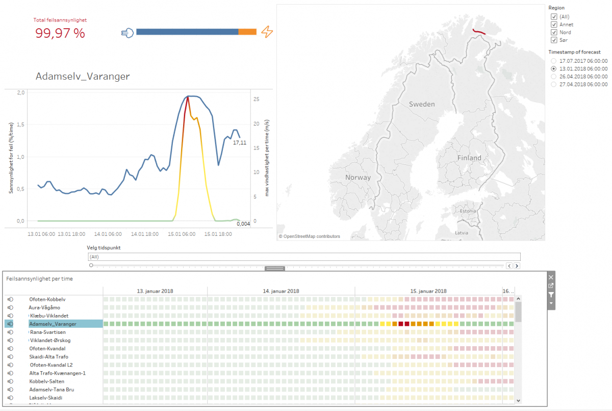
We use Tableau as a quick and easy way to create interactive and visually attractive dashboards. An example screenshot can be seen below:

In the top left corner, the information about the system state is shown. The percentage is the total probability of at least one line failing in the coming forecast period of three days. The dashboard shows the situation just before a major storm in January this year, leading to a very high failure probability. There actually occurred seven failures due to severe wind two days after the forecast. The bar plot shows which part of the estimated failure probability is due to wind versus lightning.

The main graph shows the development of failure over time for the whole power system. When no specific line is selected, this graph shows the development of the failure probability in the whole system over time:
When one line is selected, it shows the details for this line: wind speed or lightning intensity, and estimated failure probability over time.

The heat map at the bottom of the screen shows the probability of failure per overhead line per hour.

The list of lines is ordered, listing the lines that are most likely to fail on top. This provides the system operator with a good indication of which lines to focus on. The heat map shows how the failure probability develops over time, showing that not all lines are exposed maximally at the same time. The wind/lightning emoji before the name of the line indicates whether that line is exposed to high wind or lightning.
Going from idea to deployment in one week and ten minutes
This weeks goal was to go from idea to deployment in one week by setting aside all other tasks. However, as Friday evening came closer, more and more small bugs kept popping up both in the data visualization as well as in the back-end.

In the end, we got the service at least 80% complete. To get the last things in place we might need just 10 minutes more…


Leave a Reply